The Language of Michael Graves
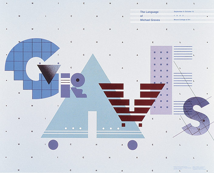
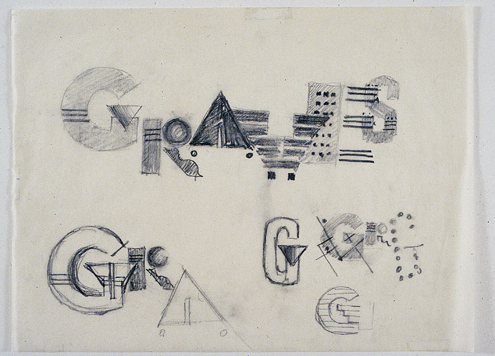
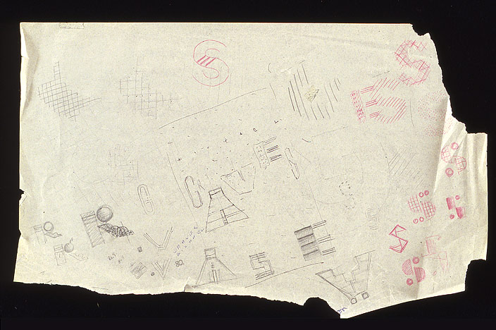
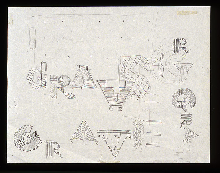
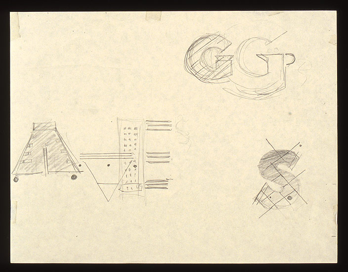
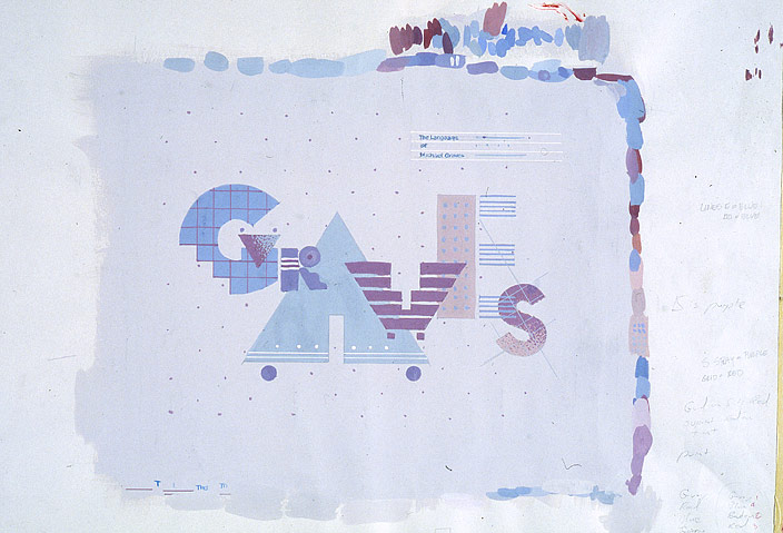
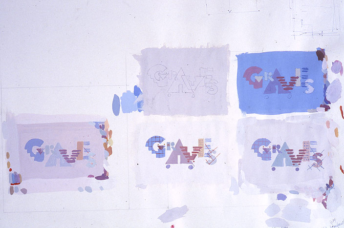
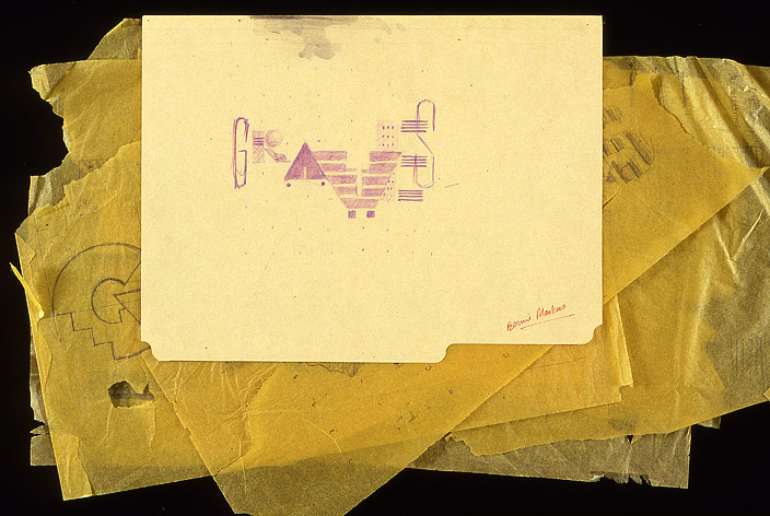
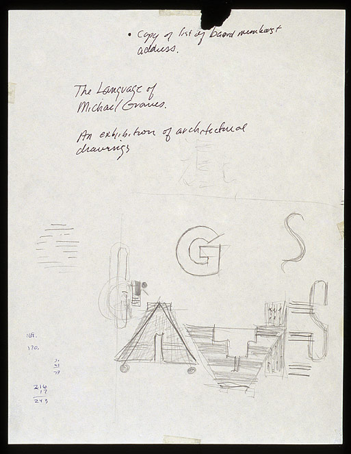
Exhibition poster announcing an exhibition of drawings by architect Michael Graves.
Goldie Paley Gallery
Moore College of Art & Design
Philadelphia, 1983
The essence of the design is best expressed by Patrick Cramsie, who is currently writing an illustrated history of graphic design for the British Library, in London, and the U.S. publisher Harry Abrams. The book deals specifically with the development of styles of graphic design in the West, and will span the earliest origins of the alphabet to current forms of digital design. It is an excellent summation of the design concepts. He writes:
Memphis had a particular appeal and influence in the US and it was here that a similar attitude towards patterning and simple suggestive forms began to be seen in graphic design. In 1983, the US designer, William Longhauser (1947–), created a poster (fig-18.4) for an exhibition of the work of perhaps the best-known postmodern architect of the time, the US architect and industrial designer Michael Graves. Longhauser centered his design around Grave’s name. He spelt out the surname with a series of architectural motifs, which were mostly made out of decorated or modular forms. The grid and stepped shape in the ‘G’, for example, made an allusion to an architect's plan and a stairway, but there were other letters that made references to specific shapes in some of Grave’s buildings. The Portland Building, in Portland, Oregon, which had been credited with marking the arrival of postmodernist architecture, was represented by two of the building's signature features: its dominant keystone-like shape, mirrored in the ‘V’; and its regular rows of small square windows, which formed the vertical stroke of the ‘E’. The building's gridded pattern of squares was also picked up in a background pattern of capital letters that repeatedly spelt out Grave’s first name, Michael. Even if these specific references in Longhauser's playful, almost childlike, patterning and shape-making were not recognized by most people, the overall design was seen as an arresting departure from the more sober and apparently rational Swiss style.
Color was an essential element in communicating the work of Graves. Ironically, the poster was printed on a one-color press, and the sheet traveled through the press five times. None of the colors are standard PMS colors. I had the good fortune of working with printers I had worked with many times before, and who were interested in the “art” of printing. They allowed me to mix each color myself by hand. The process was quite risky and nerve-racking because there was no way to adjust a color once it had passed through the press. Each new color had to be mixed to “work” with the preceding color while maintaining the essence of postmodernism.